WHEN DESIGN LEAVES THE SCREEN
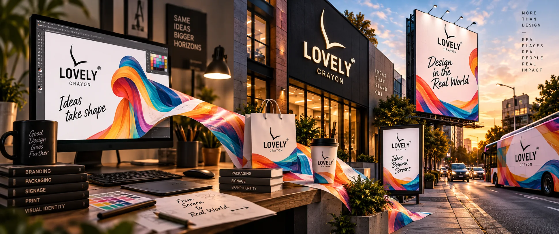
How graphic design changes when it becomes signage, packaging, hoardings, shopfronts, print and physical branding.
When Design Leaves the Screen
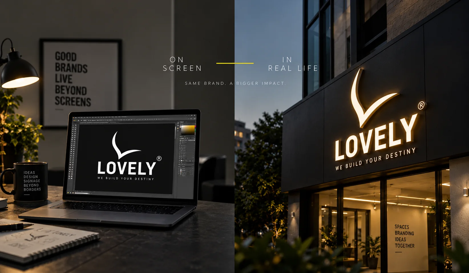
Graphic design begins on a screen. But its real test begins when it has to live in the real world. A designer can spend hours adjusting a letter by a few pixels, choosing between two nearly identical shades of blue, or moving an image a little to the left because something simply doesn't feel right. On a screen, everything is controlled. The light is perfect. The colours are precise. The viewer is usually close enough to see every detail. But then the design leaves the screen. It becomes a signboard outside a showroom, a hoarding above a busy road, a package sitting on a shelf, a shopfront seen from across the street, a brochure held in someone's hand, or a brand identity occupying an entire building. And suddenly, design has a different job. It has to survive distance, sunlight, weather, movement, material, scale and – perhaps most importantly – very little attention. That is where graphic design stops being decoration and starts becoming communication.
 pexels.com
A Screen Does Not Behave Like a Street
A design that looks beautiful on a 27-inch monitor may fail completely on a 20-foot hoarding. Why? Because scale changes meaning. A delicate typeface that looks sophisticated on a screen may disappear when viewed from fifty metres away. A subtle colour combination may lose its contrast under harsh afternoon sunlight. A beautifully detailed illustration may become visual noise when a driver has only three seconds to see it. Physical design has consequences. A signboard must be readable. A shopfront must be recognisable. A hoarding must communicate quickly. Packaging must compete for attention among dozens of other products. And a facade must make sense not only from the front, but from a distance, at different times of day, and sometimes from a moving vehicle. That is when a designer discovers whether the design was merely attractive or actually good.
Paper Boat: When Packaging Becomes a Personality

Consider Paper Boat. Its products could have been packaged in the most conventional way possible: a logo, a photograph of the drink, some information and a price. Instead, Paper Boat built much of its identity around nostalgia, Indian memories, illustrations, storytelling and distinctive packaging. The result is a useful lesson in what happens when graphic design becomes physical. The illustration is no longer just an image on a computer. It has to work on a curved package. It has to remain recognisable on a crowded shelf. It has to communicate from a distance and still reward someone who picks it up. The design becomes something people can hold, recognise and remember. And this is precisely what happens with physical branding. A design gains a new dimension when people can experience it beyond the screen.
Tanishq: When Identity Becomes a Place

Now think about a completely different situation: a jewellery showroom. For a brand such as Tanishq, the visual identity cannot exist only inside advertisements or on a website. It has to enter the physical world. The logo, typography, colours, lighting, shopfront, displays and interior environment all contribute to how the customer experiences the brand. This is where graphic design begins to meet architecture and spatial branding. A logo printed on a screen is one thing. The same identity transformed into dimensional lettering, illuminated signage, glass graphics, facade elements and a complete retail environment becomes something else entirely. It acquires depth. It occupies space. It creates an atmosphere. The brand is no longer something you look at. It becomes somewhere you are.
IKEA: When Design Has to Guide People
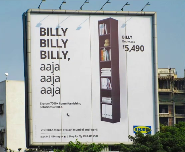
Graphic design becomes even more interesting when it has to help people move through a space. IKEA is a strong example. Its stores are not simply filled with products carrying a logo. They use typography, colour, symbols, arrows, room displays, information boards and wayfinding systems to guide visitors through enormous physical environments. This is a different kind of graphic design. It is not asking, "Does this look beautiful?” It is asking: “Can people understand where to go?” That distinction matters enormously in signage. A beautiful sign that confuses people has failed. A simple sign that instantly tells someone where to turn has succeeded. This is why physical graphic design often needs something that screen design can sometimes avoid: clarity under pressure.
“Good design is as little design as possible.”
Dieter Rams
Dieter Rams, one of the most influential industrial designers of the modern era, built much of his philosophy around simplicity, usefulness and restraint. His famous principle was, "Good design is as little design as possible.” That idea becomes particularly relevant when designing signage. A sign does not become better because another font, another colour, another photograph and another line of text have been added. Sometimes the strongest sign is the one that knows what to leave out. A few words. A clear logo. Enough contrast. Enough space. And nothing fighting for attention. Good physical design does not make people work to understand it.
When Design Finally Leaves the Screen
There is a particular moment in a branding project when something changes. The vector file is finished. The artwork is approved. Then the design becomes ink. Vinyl. Acrylic. Metal. Light. Glass. Paper. A wall. A building. A sign. And suddenly, something that existed only as pixels can be encountered by thousands of people who never saw the original design file. That is the extraordinary journey of graphic design. It starts as an idea, but its life is lived in the physical world. The best designers understand both sides. They know how something should look on a screen. But they also understand how it needs to behave on a street. And perhaps that is the real difference between designing a picture and designing a brand. A design may begin with pixels, but a brand lives in places people can actually see, touch, enter and remember. The screen is only where the idea begins.
“Design is not just what it looks like and feels like. Design is how it works.”
Steve Jobs
Planning signage of your own?
Get a quote→